- You are here:
-
Home

-
Best Practices & Strategies
- Webworks reverb checklist: is your technical documentation mobile ready?
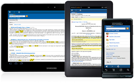 Webworks Reverb, a service provided by ePublisher, allows the publishing of content in a responsive design content management system, with the aim of providing the best possible user experience across all screens. Users viewing this type of output on a mobile device will be able to view the files in a fast, light-weight manner that is optimal for lower resolutions and/or touch operated screens. Furthermore, users on a more traditional higher-resolution computer monitor will still have the same advantages offered by a complete online help system. In other words, Reverb adapts to the traits of the device that is doing the reading of the content.
In addition, Webworks Reverb offers a commenting and end-user feedback mechanism with its Disqus commenting and discussion platform that uses the same search technology found in Google Search. For your end-users, this means they will have all the same features to search your Reverb files as they have for searching the Internet, except that it will be limited to only the Reverb files that you deploy as part of a volume or merged set of volumes.
When Webworks developed Reverb three years ago, the aim was to make a truly mobile-ready platform for help documentation, but for that, the company first had to assess what "mobile ready" meant in that case. They developed a certain set of rules, derived from major search engines, phone development companies, and other mobile best practices, that they abided by when developing Reverb and catered specifically to technical communication workflows.
Just recently Webworks shared this information in form of a very useful checklist to make clear what mobile-ready really means for technical documentation. So put your own documentation to the test:
Output displays consistently on all modern desktop, tablet, and mobile browsers;- Canonical URL that services both desktop and mobile devices;
- Professional design and layout that is consistent with your organizational branding;
- Fast page loading and optimized use of HTML5;
- Intuitive and efficient navigation controls that include support for searching, indexing, and table of contents;
- Large touch-friendly menu icons;
- Navigation and content layout that is responsive to the screen size of the device;
- Dynamic table of contents control that displays the relational context of the viewed page no matter how large the help documentation may be;
- Text-based content is easy to read regardless of the device’s screen size;
- Each page of your help documentation can be directly displayed with a unique URL;
- Displays large tables and images without distortion and without making surrounding text difficult to read;
- Provides side-by-side display of table of contents menu and content, each independently scrollable.
It took WebWorks 20 years of experience and 3 years of practical application to create the checklist as each item was tested and proven to be the best answer to several questions that content creators face today:
- How can I cater to my users’ browsing habits and keep up with current web trends?
- How do I keep the integrity of my message on different screen sizes?
- How should tables act across multiple screen sizes?
- Should I manage a template for every device, or can I have just one output?
By MediaBUZZ
