
Page 24 - AeM_June_2017
P. 24
BEST PRACTICES & STRATEGIES
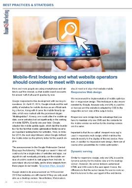
Mobile-first Indexing and what website operators
should consider to meet with success
More and more people are using smartphones and tab- should react and align their website mobile.
lets to surf the internet, so that mobile search accounts Responsive Web design
for around half of all search queries by now.
We recommend the implementation of mobile optimiza-
Google responded to this development with two key in- tion in responsive design. This technique is also recom-
novations: On April 21, 2015, Google introduced the suit- mended by Google, because only one URL is used for
ability of websites for mobile devices as an official rank- all devices and the website is adapted by CSS to the
ing criterion. Along with it came the mobile friendly up- respective screen size of the output device.
date, which was marked with the prominent slogan
"Mobilegeddon". Already one month after the mobile up- Responsive web design has the advantage that you
date, some websites lost out significantly in the ranking have to maintain only one CMS and the contents for
of mobile SERPs. Exactly one year later, Google the mobile version as well as for the desktop version
adapted the mobile update again, which laid the founda- are the same.
tion for the fact that mobile optimization finally became
an important ranking factor for websites. Then, in Octo- Important is that the so-called ‘viewport meta tag’ is
ber 2016, the next step followed, when Google defined used in responsive web design, which matches the
the mobile index as the primary index for the search en- website exactly to the display of the end device. How-
gine. ever, in addition to responsive web design, there are of
course other possibilities for mobile optimization:
The announcement in the Google Webmaster Central
Blog says the following: "Although our search index will Dynamic serving
continue to be a single index of websites and apps, our
algorithms will eventually primarily use the mobile ver- Similar to responsive design, only one URL is used in
sion of a site’s content to rank pages from that site, to dynamic serving for the mobile view and the desktop
understand structured data, and to show snippets from version. However, the server delivers customized
those pages in our results. "(Doantam Phan, Google) HTML and CSS code to the user agent. Hence, the
difference is that the server issues the source code so
Google stated in its announcement on 15 November that it is tailored to the user agent of the end device.
2016 that websites are still crawled if they are only avail-
able as a desktop version. Nevertheless, Webmasters
24 June 2017 - Mobile Marketing & Apps
