
Page 19 - index
P. 19
BEST PRACTICES & STRATEGIES
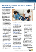
A bunch of practical tips for an optimal
mobile usability
Besides high quality standards in
content, the usability of reading
news on mobile devices is decisive
to gain traction in an attractive and
wide-reaching advertising environ-
ment for mobile campaigns pre-
ferred by users.
Take a look at the following tips on
how a mobile website should be
designed to be most useful and
marketable:
Keep navigation compact:
Especially when on the go, mo-
bile users jump quickly from one
subject to another on news por- least 7x7 mm with intervals of for the small smartphone
tals, hence, the navigation at least 2 mm is recommended. screen.
should be intelligible and com-
pact, allowing users to switch Make operating elements vis- Hence, the images should be
easily to any topic on the page ible: While users generally rec- easily recognizable, but never
they are interested in. ognize all clickable elements take up the entire visible range.
quite quickly, touch interaction
Allow shortcuts: Shortcuts to elements still have to be Select a clear caption: To
the main categories are particu- learned by many. Therefore, on make the reading of the mobile
larly important, as they bring the mobile pages it should be made page as pleasant as possible,
user effortlessly and directly to clear, which elements are func- the clearest possible typeface
the latest and most popular con- tional and what is behind them. should be chosen. Of course,
tent of the mobile page. Keep in even the font size must be
mind that at the end of the arti- Offer swipe gestures for adapted to the small size of the
cle pages, cross-links are gen- scrolling feature: By now, smartphone.
erally in high demand. most smartphone users expect
the swipe gesture for the scroll Offer easy sub-functions:
Always offer new and fresh function. However, the feature Sharing information with friends
content: Already on the landing is only fun, if it is intuitive and is just as important on the
page, users expect to get a works smoothly. smartphone as on the desktop.
quick and informative overview Therefore, all relevant "sharing"
of all current content. The latest Keep the load times short: functions should be easy to find
news and direct links to the Generally, it is all about getting and easy to use on mobile as
newest content should be dis- quick access to information, well.
played right at the top of the therefore, the loading times Hopefully, these few tips will help
page to facilitate a rapid news should be kept as short as pos-
overview. sible. For this purpose, it is rec- you to catch up to mobile users’
ommended not to display con- expectations and encourages you to
Ensure operability via touch: tent immediately in full length make your content mobile-friendly
The input via touch requires a but upload only as much as sooner rather than later, if not al-
more tidy and simplistic web needed. ready done so, especially since
design than on the desktop. All their number will only be increasing
interaction elements should be Align the layout with the use in the course of time. ◊
large enough to comfortably be of the smartphone: A good By Daniela La Marca
handled with your fingers, mix and a reasonable size of
hence, a physical size of at image and text are preferable
MediaBUZZ Pte Ltd - Independant ePublisher for Asia ediaBUZZ Pte Ltd - Independant ePublisher for Asia
M
